Thursday, 21 January 2016

20 Little but Important Things about Web Designing – Part 2

20 Little but Important Things about Web Designing – Part 2

Okay, so in the last installment of this post, I stressed on a few points that may appear as trivial, but they are in fact, very important in terms of designing. Here is a recap.

1. Saving time and effort by taking inspirations form others,
2. Optimizing line height,
3. Not sticking to a single font,
4. Optimizing column width, and
5. Using color science to optimize colors.

Here are more of those little but important things that matter in web designing.

6. Adding lines to make design uncomplicated

Adding lines can be tremendously helpful if you have a design that focuses more on text. Adding a line can help you with the fonts and give a positive feel about the whole design.

7. Priorities, priorities

Coming up with a hierarchy always makes things easier. Know what matters the most, the headline, the logo or anything else. When you know which element is the most important in your design, it becomes easier to set it apart from the rest of the elements.

8. Smart reuse of elements

UX has to stand out from the rest, but it doesn’t have to lose its touch with consistency in doing so. Smartly reusing the same fonts, colors and elements keeps things consistent and reduces the amount of work. Use it to your advantage.

9. White space doesn’t hurt

Majority of beginning designers feel empty white space is always something bad and try to fill that space up with unnecessary elements. More white space doesn’t hurt; but unnecessary content does.

10. Grouping Related Elements

It pays well to group similar elements together and it also happens to be one of the better practices in the world of web designing.

There are many website builders like glu7 and squarespace that allows you to design a desirable website for your  business. So this was the continued part of our previous post, for the next Part 3 visit us next week.

Friday, 15 January 2016

20 Little but Important Things about Web Designing – Part 1


Are you scratching your head because you are confused between hiring a pro web designer and doing it yourself? Or have you done it yourself already and are now thinking if it really gives out that professional look?

Wherever you are, just relax and read-out these points. Understanding that all the points can be too much to stomach at once, I have decided to break it into 4 parts. This is the first part.

The following are some of the little things that will give your DIY site the finishing look a pro designer gives.

1. Steal like an Artist

Even Steve Jobs acknowledged there is no shame in copying! What matters is that you should be able to blend the inspirations optimally. Referring to professional designs lets you focus more on details that matter to your website, saving your time and effort to rebuild everything from scratch.

2. Optimize line height

Optimally, line is kept at 1.6 so if things aren’t consistent in your design block, just select the font in pixels – which is 1.0 by default – and multiply it by 1.6.

3. Don’t stick to a single font

Use a set of 2 different fonts that work well together if you’re a beginner. It creates a contrasting flavor to your design.

4. Optimize your column width

Column’s width should be based on the nature of site and the page. 55-60 characters are optimum.

5. Coloring your website

There is a whole science behind colors and how they effect a design, and you can read out this post from the blog of glu7: freewebsite builder, but if you’re confused, just go with black and white.


There you go. 5 essential elements to give you head start in designing your own webpage. More is on the way. Be sure to visit this blog the next week.

Monday, 23 November 2015

Useful DIY On-page and Off-page Hacks to Improve Your Landing Page


The first rule in augmenting the efficiency of conversion path is to improve the quality of your landing page. It seems like a simple task but optimization of that one page actually requires lots of thinking and planning. 


Fear not; to optimize this lander there are two major areas where you will have to focus: on-page (the design) and off-page (the promotion).

If you are here looking for on-page and off-page hacks that will help you enhance the productivity of your landing page, read on.


On-page Factors


· Keep the design neat and free from clutter.

· Use the text, images, buttons and videos in best manner.

· Urge the users to interact and take action.

· Keep your landing page precise.

· Optimize your internal linking.

Here’s another hack for on-page if have no clue how to start with the steps listed above. Use a free website making tool like Wix, Weebly, GLU7 or Square Space and pick one from their given templates. This will ease your efforts and also give you a head start.


Off-Page Factors


· Apply the science of search engine optimization to garner more views and increase organic traffic.

· Make use of email marketing to contact subscribers and readers.

· Utilizing tools of search engine marketing

· Initiating pay-per-click campaigns for more visibility

· Using social media like Pinterest, Facebook, Twitter and Google+ to reach out to millions of social network users.


A successful conversion will require excellent use of both on-page and off-page optimization techniques. So it's crucial you don't rely on just one factor. 

Monday, 16 November 2015

How to optimize inbound marketing online?


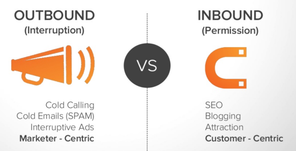
Inbound marketing means welcoming customers to your premises, instead of going out and aggressively targeting them. It is an essential part in marketing mix and thus should never be underrated, let alone ignored.

Inbound marketing works better for incoming customers because it gives them a true taste of your brand. They’re eager to know and that is why you should always s be ready for their arrival and armed in the best manner to entertain their queries.


Here are some tricks to optimize your website and thus your inbound marketing.

Take notes and put them to use

Take notes of customers. Note the path(s) which brings them to your site. Once you’ve noted, optimize that path with content that attracts, helps, solves their problems and delivers value.

Integrate a Blog

The safest bet. Visitors who have found their way to our blog are probably there because they have been looking for something and now feel that your site may have it. Every single one of those happy visitor will remember your page and will refer others facing the same problem should a situation arise.

So be sure to keep the blog updated with new and engaging content that attracts, holds, engages and captures the loyalty of your customer.

Optimizing and Simplifying Visitor's Path

Optimize every page in the conversion path. Landing page, order confirmation and thank-you pages are some that can be optimized for a better conversion rate.

Improving Load Speed

Customers tend to get furious when they see loading pages. They want a smooth and quick experience. And why not, they have better things to do. So keep your loading speed optimum. Consult with your IT team if you have to, to make pages faster without having to cut-down on valuable content.


Incorporating Share Buttons

Satisfied customers become brand evangelists. They can’t wait to share their experience with others. So making them wait is going to be a big letdown. 


This unnecessary inconvenience can be easily avoided by just integrating the sharing buttons on the pages of your website. Buttons like facebook, Twitter, Pinterest and Google Plus allows user to spread the word with just a couple of clicks. It also lets you in on potential leads. 

With a website builder like Square Space or GLU7, these elements can be easily integrated, but even if you are using custom content management system, be sure to add these elements in your website to heighten your number of visits and your conversions.


Wednesday, 4 November 2015

How to Optimize Images Using Alt-Text

Pictures speak volumes.  Although pictures shouldn’t come at the cost of textual content, the statement merely means that the power of pictorial content cannot be underestimated. From brand logos to long-scrolling detailed infographics, everything depicts the power visual content.

Powerful and meaningful as these pictures may be, there is one serious issue when it comes to them. And that issue is the inability of search engines to read them. While Google and Bing have becomes smart enough to read the text and offer data to the user according to the text, they still haven’t been able to read and analyze pictures.

This is where alternative-text, otherwise known as alt-text and alt-tag comes in.


Alt-Text

Basically, alt-text too is a text-based piece of content that signals search engines what the image in question is about. It allows search engine crawlers and bots to see what they otherwise cannot. As one can expect, alt-text is the soul of the image when it comes to image optimization. The more accurate the text, the more preference it gets from search engines because it helps them offer relevant content to the users.

How to Optimize Images?

Keeping the content as relevant as possible in alt-text is crucial, but it is also rewarding. Great visual content, backed up by the right alt-text can rank websites on top of search engines. Here are some tips on how you too, can optimize your image and your website via alt-text.

  • Keep it relevant
  • Keep it short
  • Keep it natural
  • Avoid spam and stuffing
  • Keep the focus on important aspects of the image
Whether you manually add images to your site or use a website builder, be sure to add alt-text every time.


Thursday, 8 October 2015

The Edge of using Free Website Creators in Small Businesses


Small businesses operate on limited capital so they just can’t afford to make mistakes. Most of the small businesses, due to their limitations rely on saving, which often revolves around seeking better alternatives.

If you don’t know about free website builders, let’s just say they are another great way to save money for your business. In fact, they can help you make more of it. How? Here are some perks of free website builders your business could use. 


Benefit of looks
A good-looking interfaces serves more purposes than one. It can help manage the content; it can make life easy for customers and it can improve your chances of gaining more customers.


Perks of increased traffic
Site creators feature a plethora of tools and elements which can integrated and optimized to make the site more appealing and more relevant to the visitor. The result is more traffic and better retention.


Edge of social media integration
With your social feeds linked to your website, customers can now easily get in touch with you. As for you, everything is now unified for you, making it easier to manage. Customer retention and engagement is easier to manage with free business website makers giving you social integration.


Compatibility with SEO
Being SEO-friendly is now a primary requirement for any site. Unless you are using one of these great free tools, it’s going to take more time, effort and capital to make the site SEO-friendly.


Advantage of Responsiveness
Mobile responsiveness go hand-in-hand with SEO. With April’s update, Google has made it clear that websites lacking support for mobile devices will not be given the consideration they were getting from Google. This makes mobile compatibility a must-have. Here is where website builders can come in handy as they offer responsive support for websites. Any site you will create on say, Glu7 or Wix, is going to be mobile-friendly out-of-the-box.


Friday, 2 October 2015

Learn How to Optimize Your Site for Mobile Phones and Tablets


Having one website that does it all is the essence of today’s digital marketing, SEO and SEM. A big population of the world surfs the internet through their mobile phones and tablets. This makes it even more vital to concurrently entertain users of different platforms.

So how can you reach out to those users without spending pretty pennies on programmers and developers?

The answer is simple – ‘a website creator’.

These website creators can be simple, easy and fun. But there are more reasons to try them out. Creators like GoDaddy, Wix and Glu7 also let you optimize your sites for smartphones as well as tablets.


While Wix lets you create sites on both platforms, there is one thing I found out that was better on Glu7 – it’s that the site you create on Glu7 does not need to be optimized separately for mobile platforms, i.e. it is automatically optimized for them.

Here is a short tutorial on how to create mobile-ready sites using Glu7.

Just sign in on Glu7.com, go to the dashboard and start creating your site. The interface runs on the idea of drag-and-drop so the learning curve isn’t that steep. You can edit the elements using the editors provided as well as remove objects with simple clicks.

Done creating? Good! Now onto the next step. Click on the tiny mobile icon on the top-left corner. This will change the preview of the site to mobile mode, allowing you to see how the site looks real-time in a smartphone. As you will see, the site will not need a major overhaul. Pretty much everything will already be set for a mobile surfer. You can also switch to tablet and laptop modes to see how the site looks for a tablet or a laptop user that lands on your site.


With everything in place, you are now ready to publish the website. First, click on the save button near the icons of the platforms. Now click on publish now button.

Congratulations! Your mobile-friendly site is now live.